 04.19.23
Make Public Resource Websites Less ‘BOSSy’
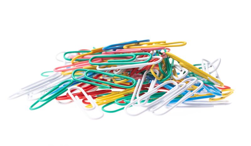
We’ve recently been working on resource directory sections of mental health, public health, and human services websites for state government. In organizing the content for these sites, we’re often presented with a situation that I’ll call “Bunch Of Stuff Syndrome,” or BOSSy.
Let’s unpack that a bit: directories of public interest resources can be very useful. They collect program names and contact information. The goal is to present the user with a list: “Here is everything that could be helpful to your situation.” But many of these resource sites are equivalent to dumping the contents of your laundry basket all over the bed. Yes it’s all there, but seeing a bunch of stuff isn’t helpful — it’s overwhelming.
A list that shows one hundred options might as well show zero - the user needs to be directed to the single most useful place to accomplish their goal.
Make resource lists less BOSSy
When displaying available resources, show only the minimum amount useful. The goal is for the user to arrive at the site, intuitively find what they need, and make the connection to complete the visit. If they have to sift through several results offered with no visual hierarchy indicating importance, the user is likely to get overwhelmed or give up. The site’s only successful when it’s helped the user make that connection.
The real work is organizing the information. Through visual design, ordering, etc., the user can be shown the most helpful information that best connects them to their desired action.
Categories are helpful, especially framed in vocabulary the end user already uses. Imagine a bridge: on one side is what the user knows and the opposite side is the resource that’ll help them. The right way to present the content is the clearest pathway that connects the user to their destination.
When search results get BOSSy
For me, search places a lot of responsibility on the user to craft a perfect query. Ask five people what they call something, and you’re likely to get five different answers. Search results often return results where a feature page is displayed between news articles. The feature page is more valuable to the user, but being mixed in with more fleeting news stories isn’t ultimately helpful. It’s BOSSy — a bunch of stuff.
It is possible through design & development to present weighted search results - a prominent visual indicator of a ‘main’ page about content, with subordinate pages for smaller pieces of content. This directs the user towards the more valuable result, and is an approach we favor.
Internal bureaucracy is BOSSy
Users need the shortest pathway to solve their problem, and that usually is unrelated to a public agency’s internal bureaucracy. We advocate as much as possible not letting your org chart become your site map.
Navigators: the ultimate BOSSy antidote
When public agencies can offer human navigators to connect users with services, it is a much higher quality of service. It makes our advertising job easier, because it gives us a simple point of contact to promote, and we trust trained operators to take it from there. Operators can also help connect users to services they don’t know to ask for. Through empathetic listening, additional opportunities to help may emerge.
Moving beyond a bunch of stuff
The reason we call ourselves Creative Distillery lies within our knack for sifting through a bunch of stuff and focusing on clarity. We understand public agencies’ missions and approach creative work with a goal to help. In short: Creative Distillery heals resource lists from Bunch of Stuff Syndrome, and makes them less BOSSy.
If you’re someone that manages resources that could help people, get in touch with us and let’s talk about how design can help present those resources in a way that’s less overwhelming and more helpful.


